06 / nCino · Admin Console Design
Admin Area Update
Two user groups, two mental models, a 50/50 vote. So I designed both, one per group.
Role
Sole Designer
Company
nCino
Platform
Enterprise SaaS
Outcome
2 concepts, on hold
Skills applied
Context
As nCino grew, so did the complexity of configuring and administering the product. The existing admin area had never really been designed with scale in mind — it had just kind of accumulated over time, and it showed. Admins were struggling to find what they needed, and there was no consistent structure to build on as new features got added.
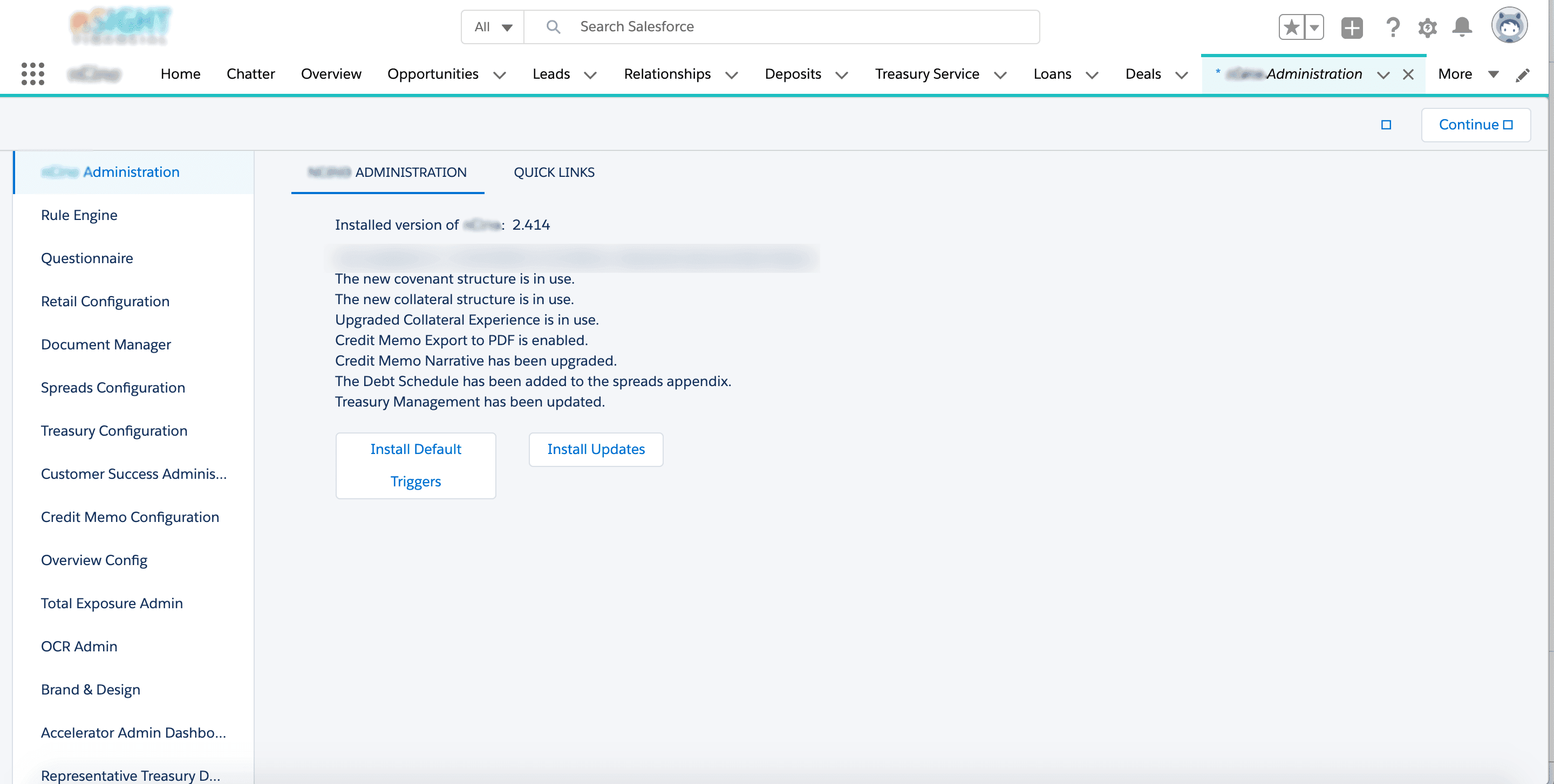
The goal of this project was to get the information architecture right, make it consistent, and set it up to scale gracefully. I was the sole designer on the project.
Research
Before jumping into solutions, I surveyed users of the admin area — both internal teams and external clients — and the results confirmed what people had been saying anecdotally.
- 50% rated the consistency of the admin area at 3/5 or below
- 50% said it was difficult to find what they were looking for
When half your users can't find what they need, that's not a minor UX polish issue — that's a real productivity problem. It gave the project a clear mandate.
With a clear problem defined, I hosted a card sorting workshop to understand how users actually thought about the admin area — not how I assumed they thought about it. I brought together two groups: implementation consultants on one side, and admin developers and PMs on the other.
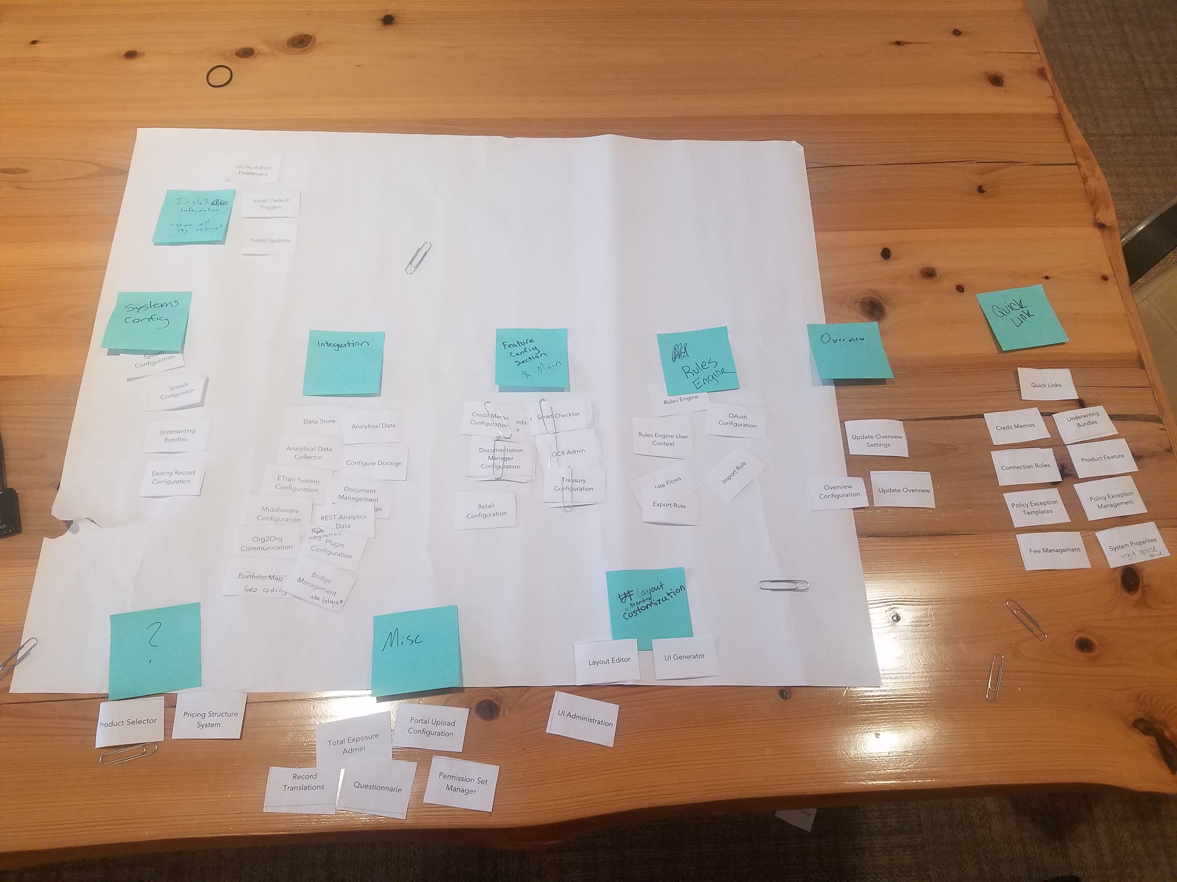
I wanted to see whether the mental models diverged based on how people used the product day-to-day. They did.
Group 1 — Implementation consultants: Gravitated toward two broad top-level categories with accessible subcategories underneath. Fewer decisions upfront, more options revealed as you go. Wider hierarchy.
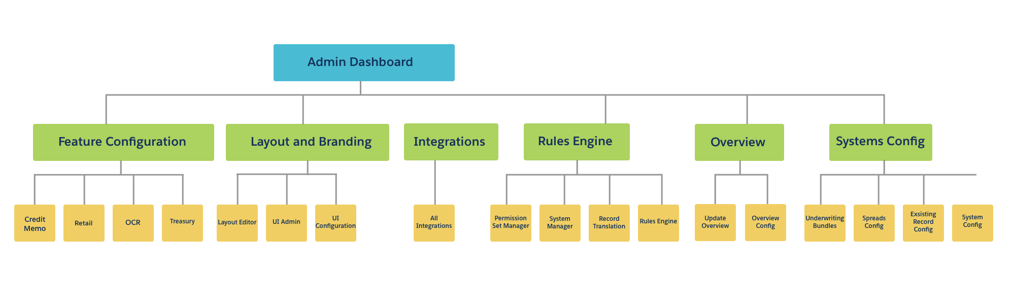
Group 2 — Admin developers and PMs: Preferred six more specific primary categories that could be drilled into for granular options. More decisions upfront, faster to navigate for power users. Deeper hierarchy.
neither group was wrong
UI Design
Since this was built on the Salesforce platform, my visual design options had some guardrails — but within those constraints, I wanted to honour one consistent piece of feedback that came up across both groups: a dark theme. People spent a lot of time in this area, and eyestrain was a real concern.
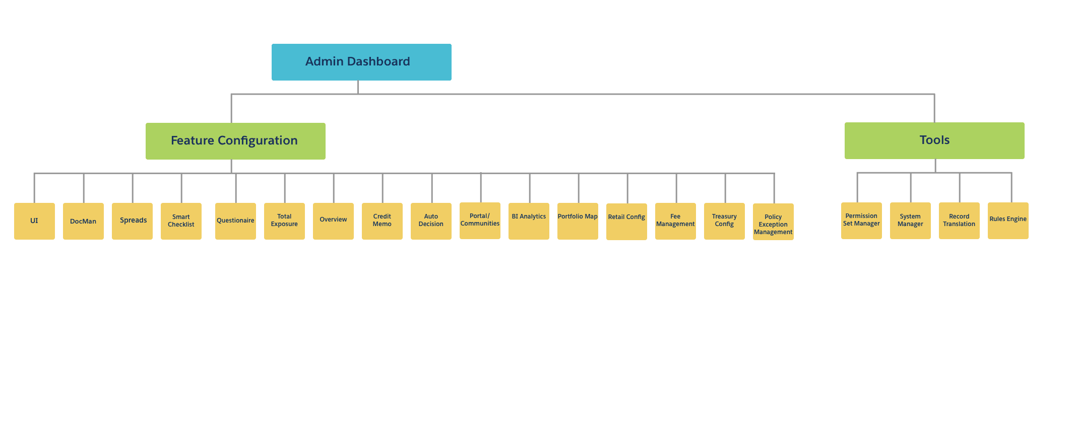
Concept 1 — Tile-based, app-like layout: One participant from the first group described imagining the options as tiles, and that stuck with me. With two broad categories and lots of choices underneath, I designed it as an app-like screen where hovering a category revealed its secondary menu. Spacious, visual, and fast to scan.
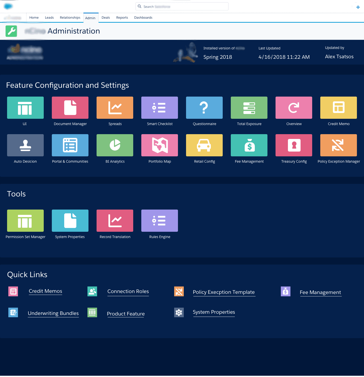
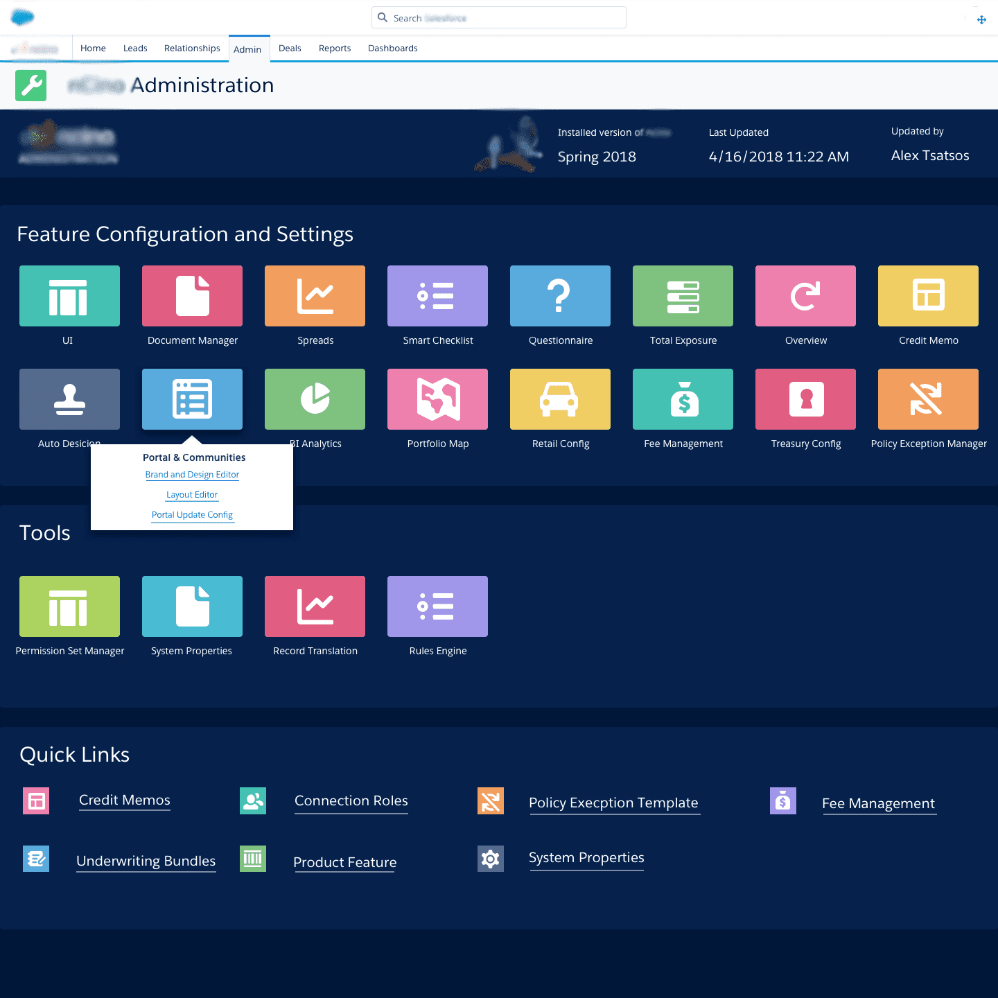
Concept 2 — Side nav with slide-out panels: The second group's preference for more specific primary categories translated naturally into a side nav. Clicking a primary item would slide out its secondary options. I also added dashboard stats to the homepage for this version — the team agreed they were a "nice but not necessary" addition, so they were included but not treated as core to the concept.
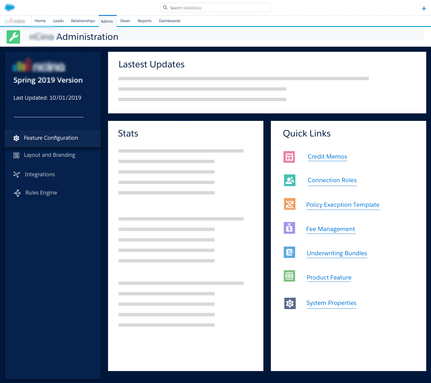
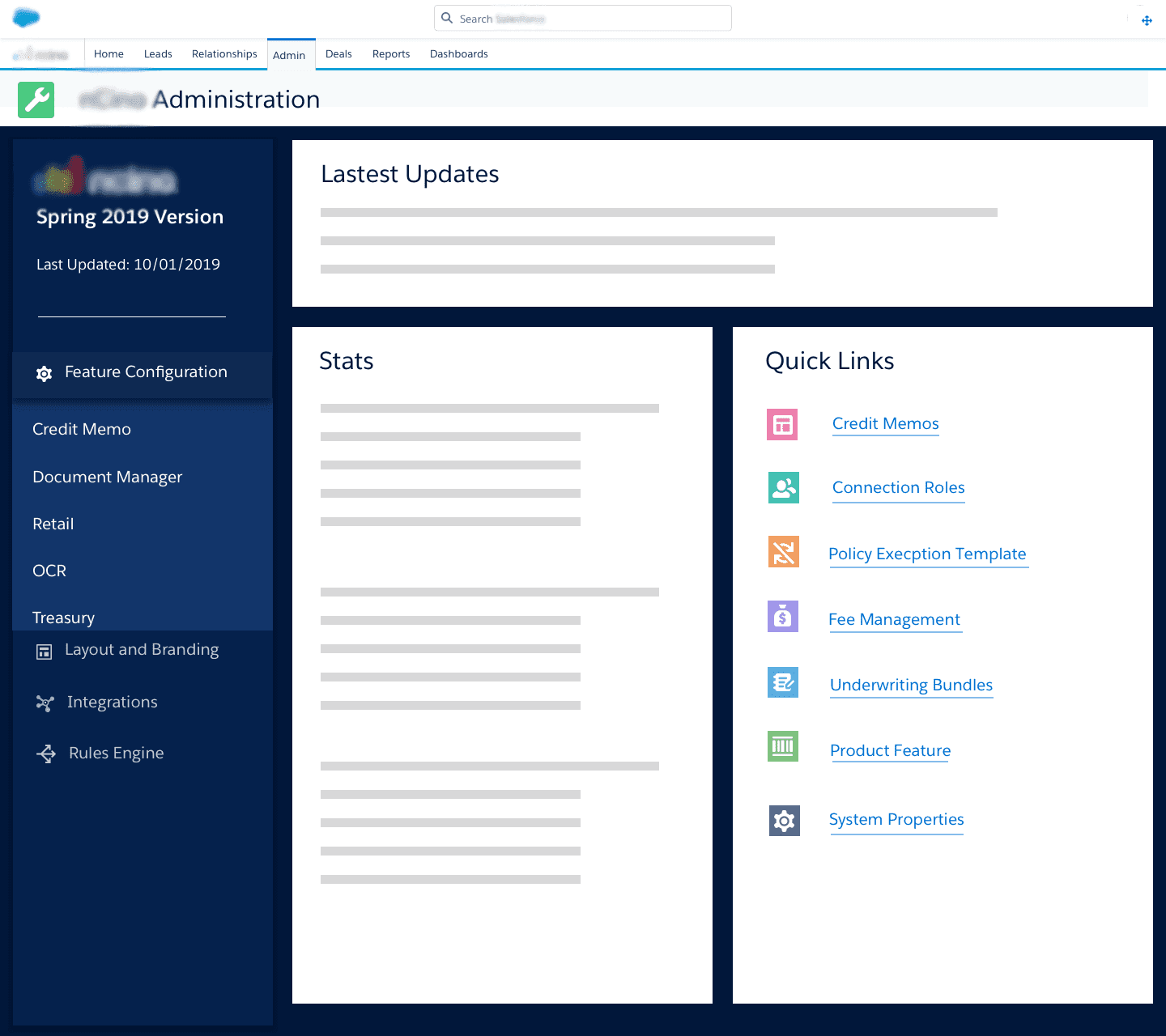
Both concepts included a persistent top bar showing key stats relevant to the current page.
Reflection
This was an amazing experience because I got to work so closely with people who actually use this interface and had the opportunity to start from scratch — which is rare when you're working on an existing product. The card sorting workshop in particular was a reminder that user mental models don't always match designer assumptions, and that both can be right at the same time.
The project was unfortunately put on hold due to Hurricane Florence in 2018, which shifted a lot of priorities for the company — but here's what I would have done next given the opportunity:
- Run A/B testing with both navigation options and gathered user feedback
- Created slight variations of both designs, then fine-tuned based on user preference signals
- Learned more about the roadmap for future features to ensure the design scales well as new items get added