07 / nCino · QA & Internal Tooling
QA Test Dashboard
Internal tools deserve real design too. Rebuilt for WCAG AA and mobile, so QA can test from the floor, not a desk.
Role
Sole Designer
Company
nCino
Platform
Desktop + Mobile
Outcome
Internal Tooling
Skills applied
Background
At nCino, I loved building relationships outside the design team — QA, dev, implementation — and one of the things that came out of that was becoming the designer other teams came to first when they had a problem worth solving.
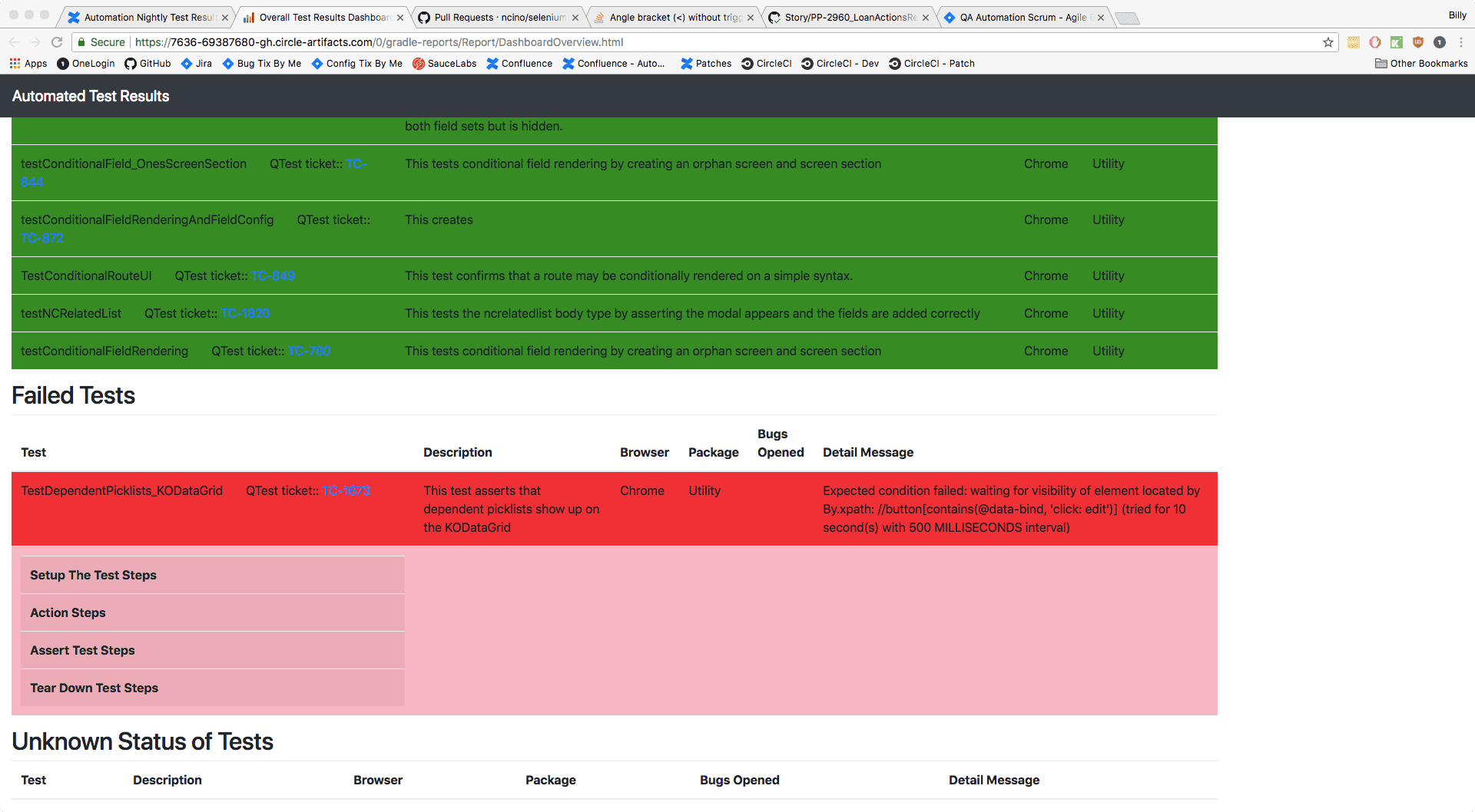
The QA team had just built a new testing tool that meaningfully sped up their workflow, but the dashboard displaying results from that tool was clunky, hard to read, and desktop-only. They came to me. I took it on alongside my regular sprint work because it was a genuinely interesting problem and because making people's day-to-day work easier is exactly the kind of thing I think good design should do.
I was the sole designer on the project.
Interviews
Before touching any mockups, I spent time with the QA team to understand how they actually used the dashboard and what would make their jobs easier. The primary goal was making it mobile-friendly. I also saw an opportunity to make the desktop version cleaner and easier to parse while I was at it.
The key question I wanted to answer was: what's the most important information on this dashboard, and how much of it needs to be visible upfront vs. revealed progressively?
After interviewing a QA team member, the answer was clear: error messages were everything. When a test failed, they needed to understand why, but they didn't need the full message immediately, just enough to get the gist. I landed on showing the first three sentences of the error message inline in the table, with the option to drill down for the full detail. Enough context to triage, not so much that it overwhelms.
A/B Testing
While making mockups, I sought separate feedback for the desktop and mobile versions.
Desktop — I wanted to know exactly how to display additional information about an item in the table in the least intrusive way possible. I talked with team members and laid out a few different options: making the rows expandable (which they currently had), opening a modal with additional information, or showing the additional information in a slide-out panel. I pulled these examples from Andrew Coyle's research article "Design Better Data Tables." After letting team members play with these options, they unanimously agreed that the slide-out panel made the most sense for their workflow.
Mobile — The other main decision was how to display the table on mobile. I drew up two possible patterns. The first was a standard table that would horizontally scroll with a sticky first column and a sticky header. The second was based on the Salesforce Lightning Design System's solution for mobile tables, which displayed each table item in a card.
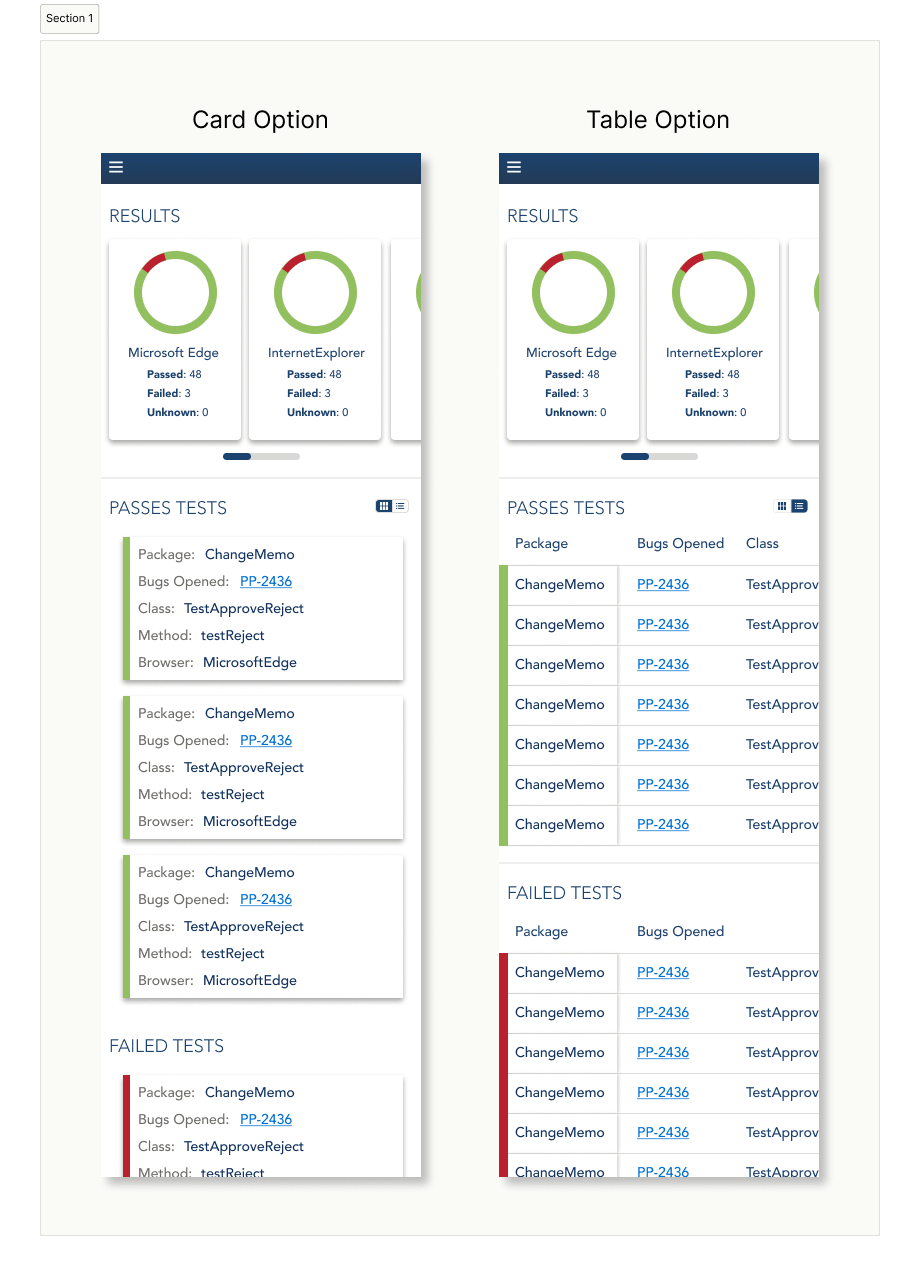
the 50/50 toggle solution
UI Design
Since this was a purely internal tool, I had freedom from the product's design style guide — which I took full advantage of. I used Material Design as a foundation and focused on making the mobile and desktop experiences feel seamless and consistent, so users could move between devices without having to reorient themselves.
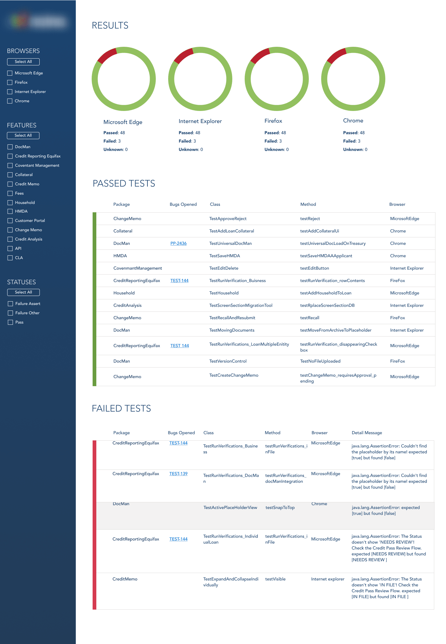
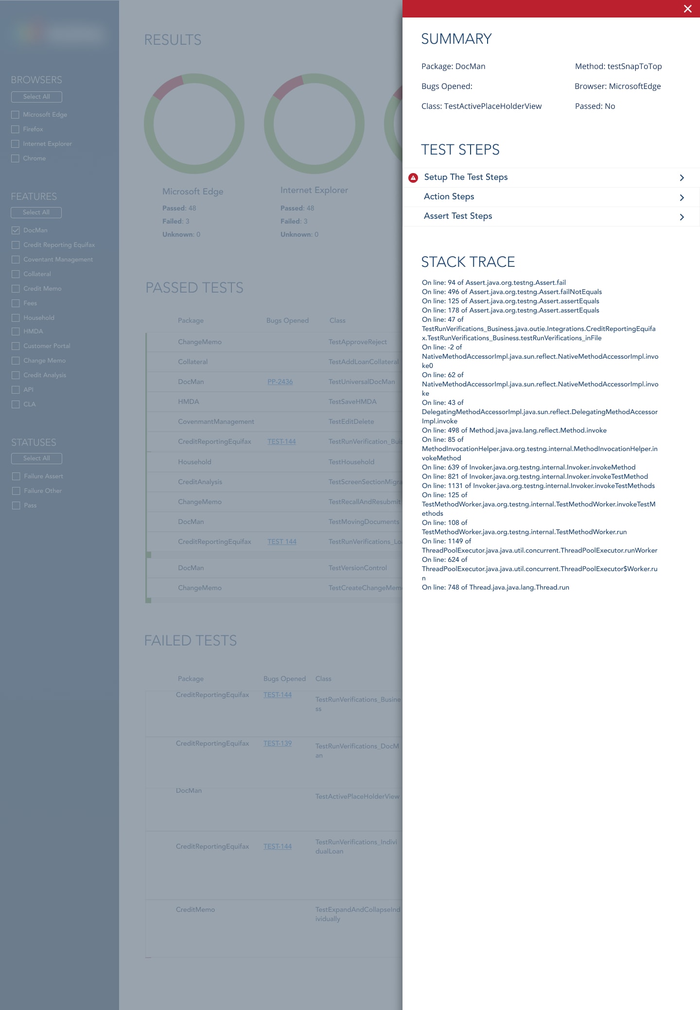
rethinking color
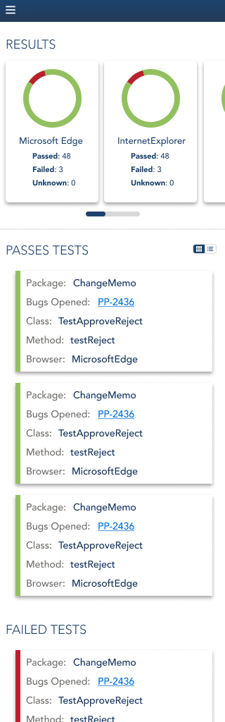
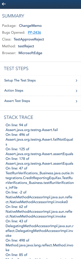
Once the key interactions were defined, I built high-fidelity clickable prototypes for both versions to let the team experience the actual behavior — the slide-out panel on desktop, and the toggle between table and card view on mobile — before anything went to development.
Reflection
This is one of my most successful projects, and I think a big part of why is how it started — with a real relationship and a real problem, not a formal brief. Working closely with the QA team from day one meant I understood their workflow well enough to make design decisions that actually fit how they worked, not just how I imagined they worked.
The information density challenge was the hardest part going in. A testing dashboard has a lot to say, and the question of what to show, when, and to whom could have gotten out of hand fast. Progressive disclosure ended up being the throughline that kept it manageable — and that only became clear because I took the time to understand what the team actually needed to see first.
If I could keep going with this one, I'd want to dig deeper into the data visualizations at the top of the dashboard and explore more options for how that summary data is displayed. I'd also want to revisit the side menu and see if there are customization options that could give individual users more control over their view.